Introduction to Bootstrap
What is Bootstrap?
Bootstrap is a free collection of tools for creating websites. It contains HTML and CSS-based design templates for typography, forms, buttons, tables, navigation, modals and other interface components, as well as optional JavaScript plugins. It also gives you the ability to create responsive designs for phones and tablets.
Advantages of Bootstrap
Mobile-first approach: Bootstrap 3 framework consists of mobile-first styles throughout the entire library.
Easy to get started: With just the knowledge of HTML and CSS anyone can get started using Bootstrap. Also, the bootstrap official website has good documentations and examples.
Responsive design: Bootstrap's responsive CSS adjusts to desktops, mobile devices like phones and tablets.
Browser support: Bootstrap is compatible with all modern popular browsers (Ucweb, Chrome, Firefox, Internet Explorer, Safari, and Opera). It contains beautiful and functional built-in components which are easy to customize
How and where to Get Bootstrap?
You can start using Bootstrap on your own website by
1. Downloading Bootstrap from getbootstrap.com
2. Including Bootstrap from a CDN (Content Delivery Network)
Downloading Bootstrap
If you want to host Bootstrap yourself, go to getbootstrap.com, and follow the instructions there.
Using Bootstrap CDN
If you don't want to host Bootstrap yourself, you can include it from a CDN.
Create your first web page with bootstrap
In this example, we are going to download and host bootstrap. We will be creating a two column responsive HTML & CSS web page that looks great on mobile, tablet, and desktop devices.
1. Create a folder named firstbootstrapwebpage
2. Download bootstrap and copy the bootstrap folder to this newly created folder. You can download the bootstrap version and files we used for this tutorial here.
3. Open Notepad or your favourite HTML editor, copy and paste the following codes:
<!DOCTYPE html>
<html lang="en">
<head>
<meta charset="utf-8">
<meta http-equiv="X-UA-Compatible" content="IE=edge">
<meta name="viewport" content="width=device-width, initial-scale=1.0">
<title>Home</title>
<!-- Bootstrap CSS file -->
<link href="bootstrap-3.0.3/css/bootstrap.min.css" rel="stylesheet" />
<link href="bootstrap-3.0.3/css/bootstrap-theme.min.css" rel="stylesheet" />
<link href="site.css" rel="stylesheet" />
</head>
<body>
<!-- Header -->
<header class="navbar navbar-inverse navbar-fixed-top bs-docs-nav" role="banner">
<div class="container">
<div class="navbar-header">
<button class="navbar-toggle" type="button" data-toggle="collapse" data-target=".bs-navbar-collapse">
<span class="sr-only">Toggle navigation</span>
<span class="icon-bar"></span>
<span class="icon-bar"></span>
<span class="icon-bar"></span>
</button>
<a href="index.html" class="navbar-brand">Bootstrap tutorial</a>
</div>
<nav class="collapse navbar-collapse bs-navbar-collapse" role="navigation">
<form class="navbar-form navbar-right" role="search">
<div class="form-group">
<input type="text" class="form-control" placeholder="Search">
</div>
<button type="submit" class="btn btn-default">Submit</button>
</form>
<ul class="nav navbar-nav">
<li class="active"><a href="index.html">Home</a></li>
<li><a href="contact.html">Contact</a></li>
<li><a href="about.html">About</a></li>
</ul>
</nav>
</div>
</header>
<!-- Body -->
<div class="container">
<div class="row">
<div class="col-md-8">
<h1>Latest Posts</h1>
<article>
<h2><a href="#">Learn WordPress development</a></h2>
<div class="row">
<div class="col-sm-6 col-md-6">
<span class="glyphicon glyphicon-folder-open"></span> <a href="#">WordPress</a>
<span class="glyphicon glyphicon-bookmark"></span> <a href="#">Plugins</a>, <a href="#">Themes</a>, <a href="#">Tutorials</a>
</div>
<div class="col-sm-6 col-md-6">
<span class="glyphicon glyphicon-pencil"></span> <a href="#">20 Comments</a>
<span class="glyphicon glyphicon-time"></span> June 24, 2016 9:00 PM
</div>
</div>
<hr>
<br />
<p class="lead">WordPress Development</p>
<p>WordPress is a content management system, usually abbreviated as "CMS" has its pros and cons. Some of the advantages include: no programming knowledge required to create websites, create websites faster, good for creating blogs, news websites and company's information website. One major disadvantage is that websites built with content management system cannot be customised to add features that are not in the framework of the CMS.
</p>
<p class="text-right">
<a href="#">
continue reading...
</a>
</p>
<hr>
</article>
<article>
<h2><a href="#">How to create three column CSS layout</a></h2>
<div class="row">
<div class="col-sm-6 col-md-6">
<span class="glyphicon glyphicon-folder-open"></span> <a href="#">CSS</a>
<span class="glyphicon glyphicon-bookmark"></span> <a href="#">HTML</a>, <a href="#">JavaScript</a>, <a href="#">Tutorials</a>
</div>
<div class="col-sm-6 col-md-6">
<span class="glyphicon glyphicon-pencil"></span> <a href="#">20 Comments</a>
<span class="glyphicon glyphicon-time"></span>June 25, 2016 9:00 PM
</div>
</div>
<hr>
<br />
<p class="lead">CSS Layout</p>
<p> Cascading Style Sheets(CSS) is a simple mechanism for adding style(e.g layout, fonts, colors, spacing) to Web pages. </p>
<p class="text-right">
<a href="#">
continue reading...
</a>
</p>
<hr>
</article>
<article>
<h2><a href="#">Learn HTML and Javascript</a></h2>
<div class="row">
<div class="col-sm-6 col-md-6">
<span class="glyphicon glyphicon-folder-open"></span> <a href="#">CSS</a>
<span class="glyphicon glyphicon-bookmark"></span> <a href="#">HTML</a>, <a href="#">JavaScript</a>, <a href="#">Tutorials</a>
</div>
<div class="col-sm-6 col-md-6">
<span class="glyphicon glyphicon-pencil"></span> <a href="#">20 Comments</a>
<span class="glyphicon glyphicon-time"></span> June 26, 2016 9:00 PM
</div>
</div>
<hr>
<br />
<p class="lead">HTML and Javascript </p>
<p>HTML(Hypertext Markup Language) is a mark up language used for creating web pages. Its is made up of tags that are enclosed in angled brackets: < >. Some tags stand alone and some come in pairs. In paired tags the ending tag starts with a slash: /
</p>
<p class="text-right">
<a href="#">
continue reading...
</a>
</p>
<hr>
</article>
<article>
<h2><a href="#">Free Plugins and Themes for website development</a></h2>
<div class="row">
<div class="col-sm-6 col-md-6">
<span class="glyphicon glyphicon-folder-open"></span> <a href="#">WordPress</a>
<span class="glyphicon glyphicon-bookmark"></span> <a href="#">Plugins</a>, <a href="#">Themes</a>, <a href="#">Tutorials</a>
</div>
<div class="col-sm-6 col-md-6">
<span class="glyphicon glyphicon-pencil"></span> <a href="#">20 Comments</a>
<span class="glyphicon glyphicon-time"></span> June 27, 2016 9:00 PM
</div>
</div>
<hr>
<br />
<p class="lead">Free or Premium Plugins and Themes </p>
<p>WordPress plugins are bits of software that can be uploaded to extend and expand the functionality of your WordPress site. Plugins are basically tools to help us build our website. Themes are skeletons to make and customize a website.</p>
<p class="text-right">
<a href="#">
continue reading...
</a>
</p>
<hr>
</article>
<article>
<h2><a href="#">Create website from scratch using Notepad</a></h2>
<div class="row">
<div class="col-sm-6 col-md-6">
<span class="glyphicon glyphicon-folder-open"></span> <a href="#">CSS</a>
<span class="glyphicon glyphicon-bookmark"></span> <a href="#">HTML</a>, <a href="#">JavaScript</a>, <a href="#">Tutorials</a>
</div>
<div class="col-sm-6 col-md-6">
<span class="glyphicon glyphicon-pencil"></span> <a href="#">20 Comments</a>
<span class="glyphicon glyphicon-time"></span> June 28, 2016 9:00 PM
</div>
</div>
<hr>
<br />
<p class="lead">Learn HTML</p>
<p>For static HTML website, you don't actually need a "what you see is what you get"(WYSIWYG) web editor software. You can create web pages using Notepad. Advantages of using notepad as a beginner is that you will learn the basics of how a HTML web page is created, but as you grow you can use a web editing software like dreamweaver, visual studio e.t.c
</p>
<p class="text-right">
<a href="#">
continue reading...
</a>
</p>
<hr>
</article>
<ul class="pager">
<li class="previous"><a href="#">← Previous</a></li>
<li class="next"><a href="#">Next →</a></li>
</ul>
</div>
<div class="col-md-4">
<div class="well text-center">
<p class="lead">
Don't want to miss updates? Please click the below button!
</p>
<button class="btn btn-primary btn-lg">Subscribe to my feed</button>
</div>
<!-- Latest Posts -->
<div class="panel panel-default">
<div class="panel-heading">
<h4>Latest Posts</h4>
</div>
<ul class="list-group">
<li class="list-group-item"><a href="#">Learn WordPress development</a></li>
<li class="list-group-item"><a href="#">How to create three column CSS layout</a></li>
<li class="list-group-item"><a href="#">Learn HTML and Javascript</a></li>
<li class="list-group-item"><a href="#">Free Plugins and Themes for website development</a></li>
<li class="list-group-item"><a href="#">Create website from scratch using Notepad </a></li>
</ul>
</div>
<!-- Categories -->
<div class="panel panel-default">
<div class="panel-heading">
<h4>Categories</h4>
</div>
<ul class="list-group">
<li class="list-group-item"><a href="#">WordPress Tutorial</a></li>
<li class="list-group-item"><a href="#">Web Design</a></li>
<li class="list-group-item"><a href="#">Web Development</a></li>
<li class="list-group-item"><a href="#">Computers</a></li>
<li class="list-group-item"><a href="#">Phones</a></li>
</ul>
</div>
</div>
</div>
</div>
<!-- Footer -->
<footer>
<div class="container">
<hr />
<p class="text-center">Copyright © Bootstrap tutorial 2016. All rights reserved.</p>
</div>
</footer>
<!-- Jquery and Bootstrap Script files -->
<script src="jquery-2.0.3.min.js"></script>
<script src="bootstrap-3.0.3/js/bootstrap.min.js"></script>
</body>
</html>
4. Save the file by clicking the "File" menu, followed by the "Save As...". In the save As box, type the name of the file as "index.html" and make sure you select "All Files" under "Save as Type". On the navigation panel by the left, select desktop, look for the folder you created named firstbootstrapwebpage, double-click on it, click on the save button below to save the file. This is going to be your homepage.
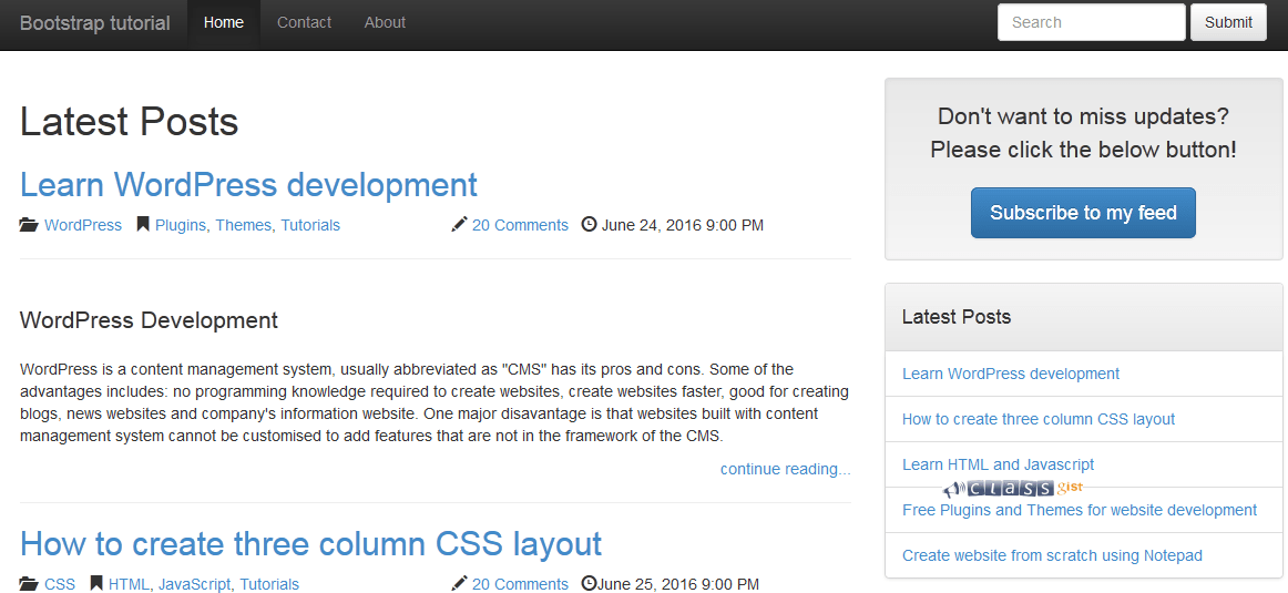
5. Now open this file with any web browser. You should see the following web page.
From the code above, you will notice the following lines at the beginning
<!DOCTYPE html>
<html lang="en">
Bootstrap uses HTML elements and CSS properties that require the HTML5 doctype. Make sure you always include the HTML5 doctype at the beginning of the page.
Line 6 is necessary to ensure proper rendering and touch zooming on mobile devices.
<meta name="viewport" content="width=device-width, initial-scale=1.0"> --- line 6
Lines 11 and 12 points to the location on our computer where we hosted the bootstrap files.
<link href="bootstrap-3.0.3/css/bootstrap.min.css" rel="stylesheet" /> --- line 11
<link href="bootstrap-3.0.3/css/bootstrap-theme.min.css" rel="stylesheet" /> --- line 12
To use bootstrap CDN, we would replace lines 11 and 12 with
<!-- Latest compiled and minified CSS -->
<link rel="stylesheet" href="http://maxcdn.bootstrapcdn.com/bootstrap/3.3.6/css/bootstrap.min.css">
<!-- jQuery library -->
<script src="https://ajax.googleapis.com/ajax/libs/jquery/1.12.4/jquery.min.js"></script>
<!-- Latest compiled JavaScript -->
<script src="http://maxcdn.bootstrapcdn.com/bootstrap/3.3.6/js/bootstrap.min.js"></script>
Lines 21 and 48 are containers in bootstrap. Containers are elements used to wrap site contents
<div class="container"> ---- line 21, line 48
Lines 50 and 223 are Divs used to create a two column layout page. Bootstrap's grid system allows up to 12 columns across the page. You can group the columns together to create wider columns.
<div class="col-md-8"> ---- line 50
<div class="col-md-8"> ---- line 223
Bootstrap grid system has four classes:
xs (for phones)
sm (for tablets)
md (for desktops)
lg (for larger desktops)
The classes can be combined to create more dynamic and flexible layouts.
Next, Learn more about Bootstrap Grid System